Impact Tracker
What this is for, in one sentence: Impact Tracker puts every change you make — a rewritten page, a fixed schema, a PR push — on the same timeline as your AI-visibility metrics, so you can see what moved when you made it.
When to come here:
- Right after you ship a fix or a content change, to pin it to a date before you forget
- Once a full before/after window has passed, to read whether anything moved
- When someone asks “did that actually do anything?” — this screen answers honestly, not optimistically
Priya Nair at MenuPilot ships something most weeks, and the question after every one is the same: did it move the needle? Impact Tracker is where she pins the change to a date and comes back later for the honest answer, coincidence and all.
Reading the trend
Section titled “Reading the trend”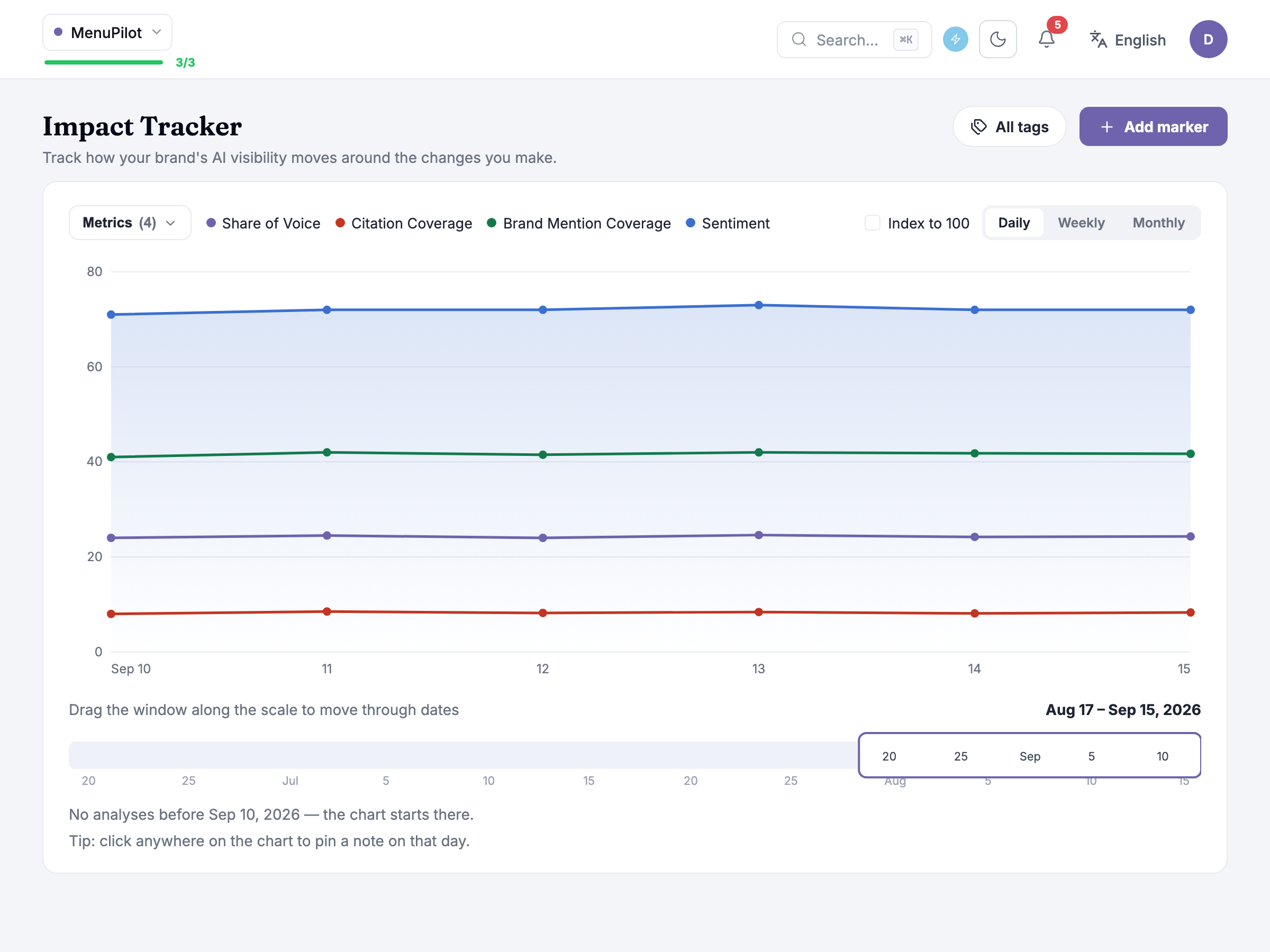
The chart plots four brand metrics by default: Share of Voice, Citation Coverage, Brand Mention Coverage and Sentiment. Citation Coverage and Brand Mention Coverage are coverage measures out of your tracked prompts — how many of them cited you, and how many named your brand at all. Share of Voice is a share of a different thing: of all the brand mentions across those answers, the proportion that were yours. Sentiment works differently again: each prompt’s answer is scored 0, 50 or 100 for negative, neutral or positive, and the line plots the average, landing on the same 0–100 axis without being a percentage of anything.
Points on the brand metrics only land on days an analysis actually ran. Between two analysed days, the line holds flat at the last measured value rather than inventing movement — a held point’s tooltip names the day the value is carried from.
Three controls sit above the chart. Index to 100 restates every line as a percentage of its own first measured value, so all of them start at 100 — a metric moving between single-digit percentages and one moving between tens of points then sit on one comparable axis instead of the smaller one reading as flat. The daily / weekly / monthly buttons change the grain — daily for reacting to something you just shipped, weekly and monthly for a smoother read.
Directly under the plot sits the scale itself: a fixed window of about 30 days you drag along a longer beam ending today, captioned Drag the window along the scale to move through dates — with the window’s own range, Aug 17 – Sep 15, 2026, printed at the right-hand end of that same line.
Marking a change
Section titled “Marking a change”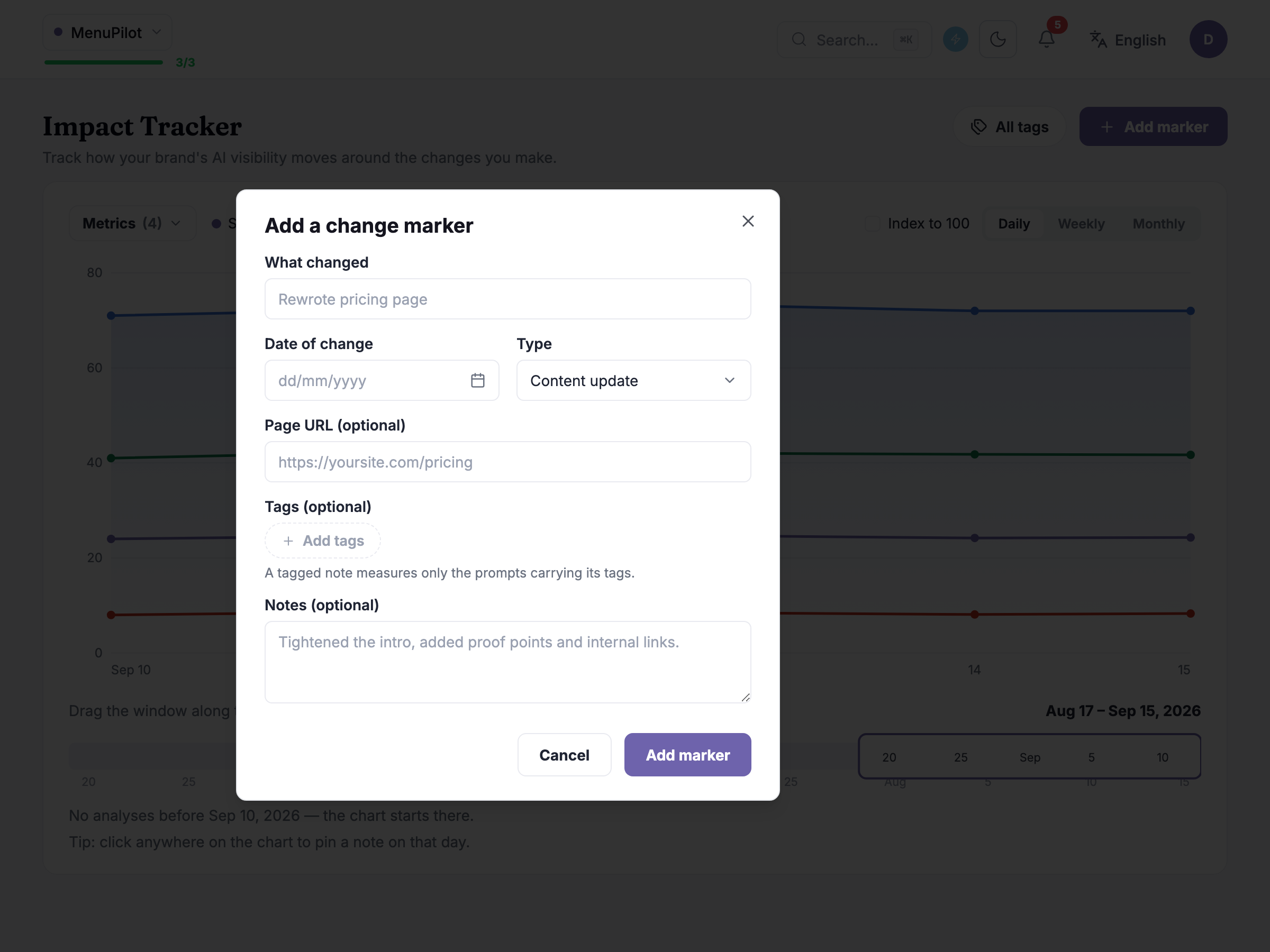
Add marker, in the header, opens a short form: What changed (a title), Date of change, a Type list — Content update, Technical fix, PR / campaign, External / algorithm, Other — plus Page URL (optional), Tags (optional) and Notes (optional). The same modal reopens for editing.
You don’t have to open the modal at all — clicking anywhere on the chart opens a small new note composer pinned to that day, with the same fields; type a title, press pin note, and it’s on the timeline.
Tags do more than organise your markers: a tagged note measures only the prompts carrying its tags, so a marker tagged to your pricing prompts gets its before/after measured against pricing prompts only. Leave it untagged and it’s measured against everything.
One naming note: the header button and this modal call the object a marker, but the composer you open by clicking the chart calls the same thing a note — one object, two names. Either way, adding, editing or removing one doesn’t touch your analysis quota; it’s a note on the timeline, not another AI call.
Choosing what to plot
Section titled “Choosing what to plot”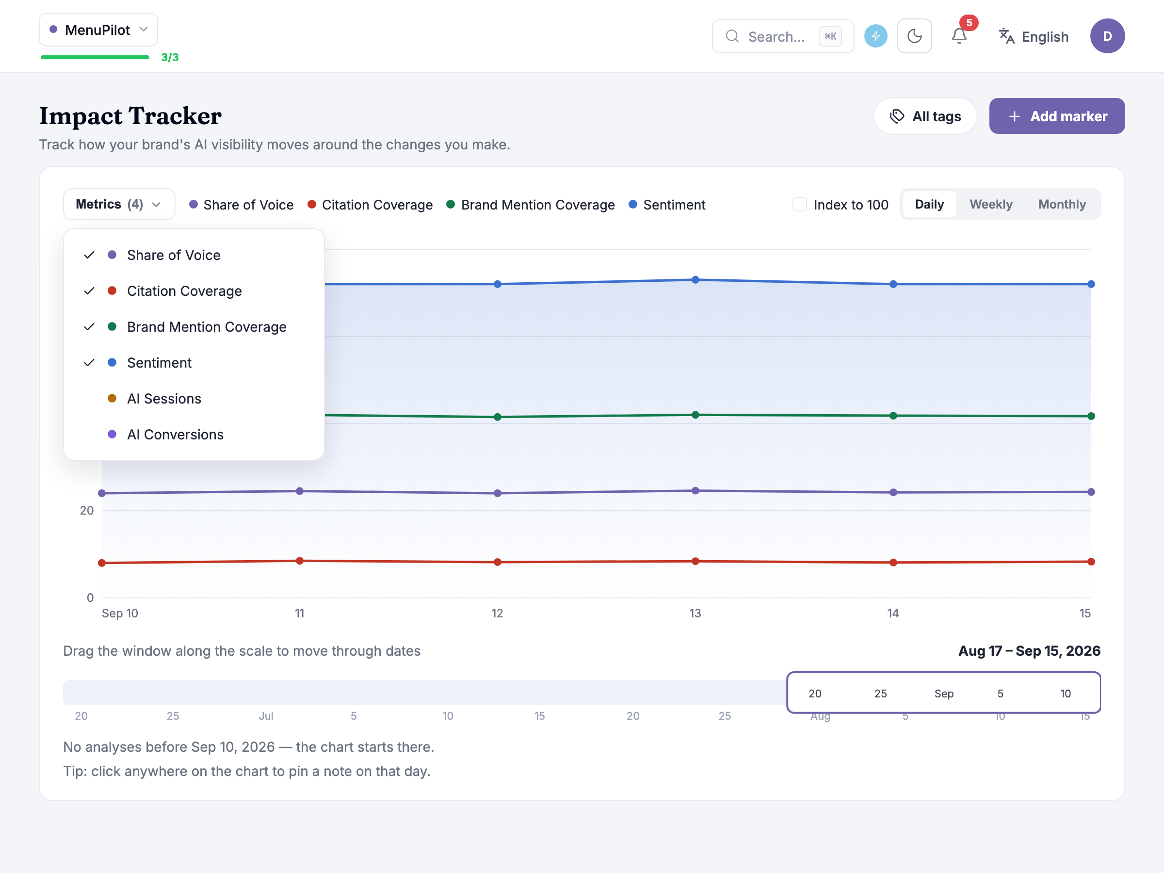
The metrics menu, at the top left of the chart panel, controls which lines are on the chart; the count beside it — (4) — is how many are currently drawn. The four brand metrics are on by default; once Google Analytics is connected, AI Sessions and AI Conversions join the list as opt-in lines — real sessions and conversions attributed to AI referrers, so you can see whether a change moved actual traffic, not just tracked coverage.
Everything plotted here has a companion underneath the chart: the Change impact table compares the most recent week against the week before each change, across every brand metric plus, once connected, AI Sessions, AI Conversions and an AI CVR column — with its own caption naming exactly what it is: change that coincided with the note, not proven cause.
A row reads Not measurable yet until a full week has actually passed — no partial-week estimate stands in for it. And because the before window looks back across the week right before the change, two markers set close together can overlap: the table flags it when another marker’s date falls inside this one’s before period, since the movement can’t then be pinned on either alone.
Honest guidance — coincided, not caused. The chart, the table, every delta — all show what happened around a change, never why. A number moving after you shipped something is consistent with the change working; it isn’t evidence the change caused it. Treat every delta as a lead worth investigating, not a verdict.
Honest guidance — give a change room to be measured. Ship one change, let its full before/after week run, then ship the next — stack two into the same week and their windows overlap, and neither can be credited alone. A full week is also the floor, not a target: reading a delta any earlier is reading noise.
Before Google Analytics is connected
Section titled “Before Google Analytics is connected”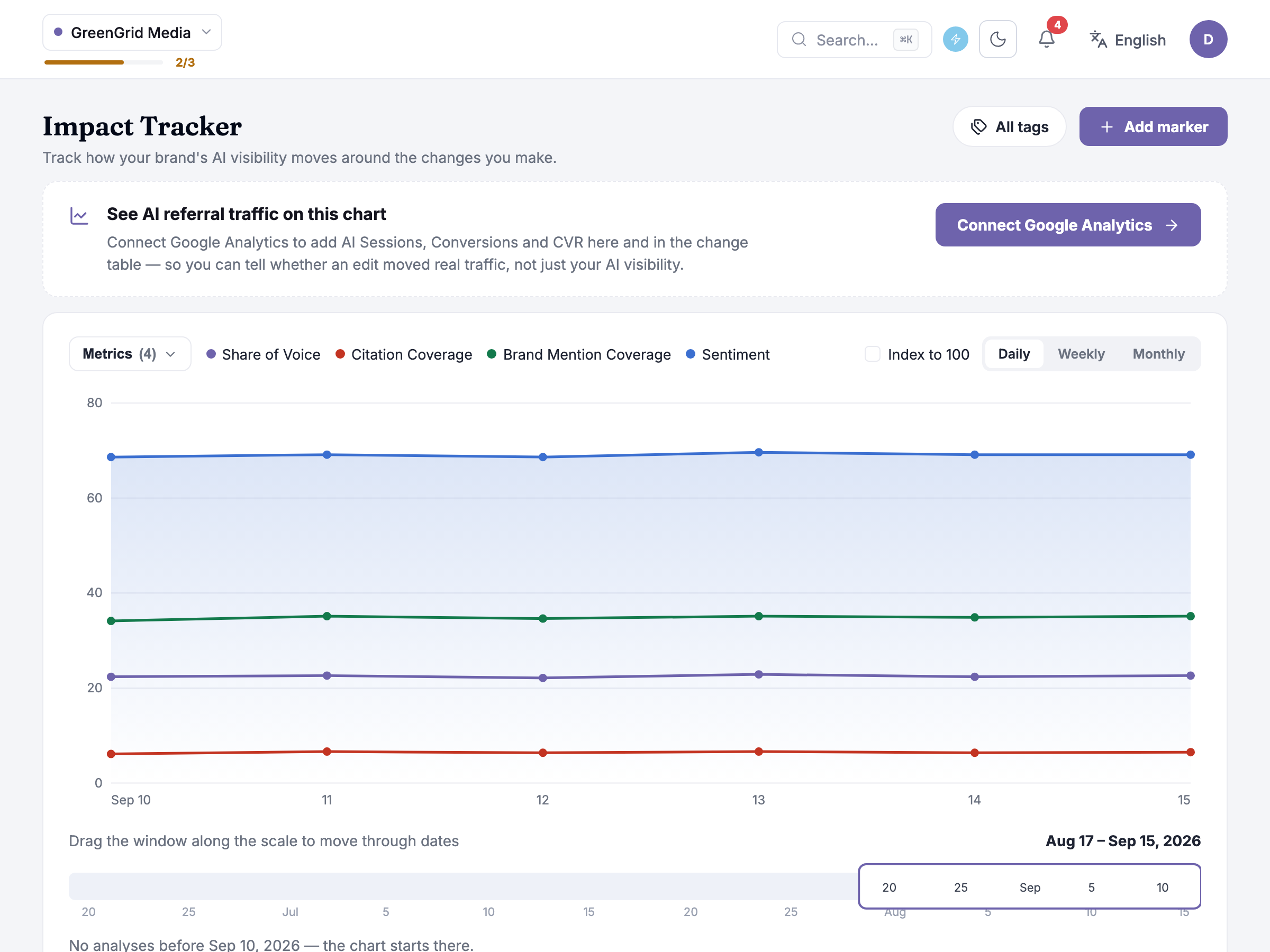
Without Google Analytics connected, the visibility side of this screen works exactly the same — Nadia Rahman at GreenGrid Media sees her four brand metrics, the chart, markers and the Change impact table just as Priya does. What she doesn’t have yet is the traffic side: a banner above the chart — See AI referral traffic on this chart — explains what connecting adds — in its own words, AI Sessions, Conversions and CVR, here and in the change table — so a marker’s impact can eventually be read in real visits, not just visibility metrics. The table does drop those columns until then — but it says so in its own header, Connect Google Analytics to add AI traffic columns, rather than leaving a reader to notice the gap.
Connect Google Analytics doesn’t happen on this screen itself — the button hands you off to where the connection actually lives. See Site Traffic for that flow; connect there once, and Impact Tracker picks it up automatically.
Common questions
Section titled “Common questions”Why does my chart only go back to a certain date and no further? It only draws points from your first analysed day forward — there’s nothing to plot before your prompts were first tracked, so the line starts there rather than showing a flat guess.
I tagged one marker and its numbers look nothing like an untagged one — is that a bug? No — a tagged marker is measured only against the prompts carrying that tag, while an untagged marker is measured against your whole tracked set. Different denominators, both correct for what they’re scoped to.
My marker still says “Not measurable yet” — when does that change? Once a full week has passed since the change date. There’s no earlier estimate, on purpose — a partial week isn’t a comparable window.
What to do next
Section titled “What to do next”- Site Traffic — connect Google Analytics there to unlock the AI Sessions, AI Conversions and AI CVR columns everywhere on this screen.
- AI Visibility Dashboard — the same four brand metrics, read as a scoreboard rather than a before/after.
- Take Action — the tools (Content Generator, Content Optimizer, Schema Generator, LLMs Generator) where most of the changes worth marking here actually get made.